Powerpivot - chart of top customers since Inception
Today’s posting is about how to create a visualization that makes the sales history of different customers comparable. This should be achieved by normalizing the sales of all customers according to the date of their first sales transaction.
The result will look like this....
..showing that the company’s profit mainly came from the 4 top customers whereas all have a similar development during their first two years.
The solution is by the way similar to the great example here.
First we need to add a calculated column to our fact table (sales table) that tracks the number of months between each transaction and the first transaction of that customer.
This could be read as “calculate the difference in years multiplied by 12 and add the difference in months to return the total number of months between the current transaction and the first transaction of that customer”.
To return the first sales date of each customer, the calculated column [Customer First Sale] on the customer table is defined as follows:
In order to make these raw data more usable, we add a dimension table that will be used as the x-axis of our chart. As explained in sqlbi’s posting, we could create a linked table that store our new dimension table. In our BI product we use simple SQL-Views that provide the necessary dimension structure. Regardless of the source, the dimension in Powerpivot looks like this:
For our scenario, we actually only need the Age Month column.
We need to create a relationship between our fact table and this new dimension table:
The last step to complete the data model is to create a new calculated measure that is used on the chart.
The base measure [Sls Amnt] that we use is just summarizing the sales column of our fact table. Here we use our new Customer Loyalty table to filter down to those transactions that happen before or at the month (customer age) we are looking at.
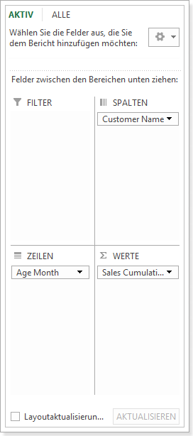
So let’s put everything together into a new pivot-table that is actually quite simple:
Adding the pivot-chart on top of this table gives as the result as shown at the beginning of this posting.
One of the great advantages of Power Pivot is its measure’s very dynamic behaviour. For example let’s imagine that our CEO wants to see the same chart differentiated by legal entity (called company in Microsoft Dynamics NAV) – we just need to add a slicer:
This type of analysis could also be easily adapted to show products, salesperson or other dimensions:


