Analyse Sales Correlations in Power Pivot with Dynamics NAV
Today we are blogging about how to report on sales correlations between different products in NAV. This type of analysis is well known in popular online-shops such as Amazon that create product suggestions and can be used for cross-selling, upselling and promotional actions. We want to allow analysts to answer questions such as: If a customer bought a certain product, what other products could also be of interest?
In our first part of we will show how to create this sort of analysis using NAV’s data in Excel with Power Pivot. Part 2 will explain how to embed visualisations such as this sales correlation into Dynamics NAV by using Client Extensibility. We are using a NAV 2013 R2 Cronus Extended database.
Final result first
First let us take a look at final result in Excel in order to create the solution from scratch afterwards:
The values mean that this percentage of customers bought both the product on the line and the product on the column.
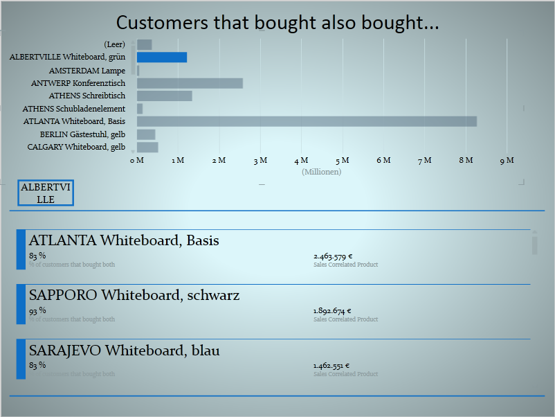
Furthermore using Power View on the same data we allow users to discover more details on the correlation coming from a single product:
Here we choose a product in the top area – in our example product Atlanta Whiteboard grün/green and are able to see the best-selling correlated products below. Atlanta Whiteboard, Basis was bought by 83 % of customers that bought the Atlanta Whiteboard, green:
Creating the NAV-part
To create this solution we start in Dynamics NAV in order to define our OData Web Services that will be used in Power Pivot. We start by creating a simple query that we are using as our main fact table:
Aside from defining these columns we need to define how both data items are related; this is done by adding the following to the DataItemLink-property: Document No.=Sales_Invoice_Header."No."
Furthermore we need three dimension tables: customer, item and date. For item and customer we are using the existing standard pages 21 (Customer Card) and 30 (Item Card) without any modifications. As explained here we are using our own date table from NAV. The published web services should look like the following:
Creating the Power Pivot data model
Starting from an empty power pivot file we import those four feeds as explained here.
After adding the following table relations...
...the diagram view should show the following data model:
All but one tables are normal lookup-tables. Worth some words is the table ItemCorrelated in the lower right corner. It is not related to any table. It is not related to the fact table since our field ProductNo is already related to the Item-table. We could use an inactive relationship here or could even duplicate the fact table but our solution works without any table relation.
Our main measure that gives us the number of customers in the intersection of product A and product B is the following:
[NoOfCustomersInProductIntersection ]:
=IF (
HASONEVALUE ( ItemCorrelated[ItemNoCorrelated] );
CALCULATE (
COUNTROWS (
VALUES ( SalesFactCorrelation[BillToCustomerNo] )
);
CALCULATETABLE (
DISTINCT ( SalesFactCorrelation[BillToCustomerNo] );
ALL ( 'Item' );
FILTER (
ALL ( SalesFactCorrelation );
SalesFactCorrelation[ProductNo]
= VALUES ( ItemCorrelated[ItemNoCorrelated] )
)
)
)
)
The important part is in and behind the calculatetable: it generates a filter context by creating a list of unique customers that have bought product B (ItemCorrelated). This filter is used in the outer COUNTROWS to count the number of customers that bought product B. In this section we do not need to explicitly filter on product A since the relationship that we defined works as an implicit filter. As a result we get what we need - the intersection of both products. Alternatively to the inner filter we could have used an inactive relationship as mentioned above.
We need another intermediary measure to calculate the number of all customers that bought product A (regardless of product B):
[NoOfAllCustomers]:=
CALCULATE (DISTINCTCOUNT ( SalesFactCorrelation[BillToCustomerNo] );
)
And our ratio that is used in the correlation matrix:
[% of Customers that bought both] :=
DIVIDE (
[NoOfCustomersInProductIntersection];
[NoOfAllCustomers])
When creating a Pivot Table based on Item on rows, Item Correlated on columns we will get this pivot table:
Since the 100 % in the diagonal do not provide a lot of insights (obviously all customers that have bought product A also have bought product A) we could add a new measure that will just return blanks if the product on the rows and on the columns are the same.
If we want to know the value of product A sales for those customers that also bought product A - as we did in the Power View visualisation - another measure is necessary. This measure follows a logic similar to [NoOfCustomersInProductIntersection]. Instead of counting the customers we are summarizing the line amount and we are creating a filter only to summarize the line amounts of those customers that have bought both product, what translates to
FILTER (
customer;
[NoOfCustomersInProductIntersection] > 0
);
The entire measure will be the following:
[SalesOfProductB] :=
IF (
HASONEVALUE ( ItemCorrelated[ItemNoCorrelated] );
CALCULATE (
SUM ( SalesFactCorrelation[LineAmount] );
FILTER (customer;[NoOfCustomersInProductIntersection] > 0);
FILTER (
ALL ( SalesFactCorrelation );
SalesFactCorrelation[ProductNo]
= VALUES ( ItemCorrelated[ItemNoCorrelated] )
);
ALL ( 'Item' )
)
)
Creating the Power View visualisation
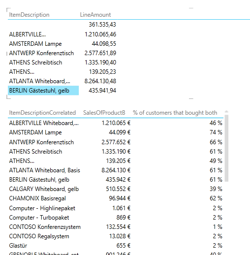
In order to create a Power View report as shown at the beginning of this post, we first create two simple tables in Power View:
We just need to change the layout of of both tables - in our example we changed the first to bar chart and the second to card. One of the great things about Power View is how one visualisation can act as a filter for another one on the same screen. That is why choosing a product by clicking on the data bars will act as a filter on product A thus showing the correlation of the selected product to the products in the lower part.


